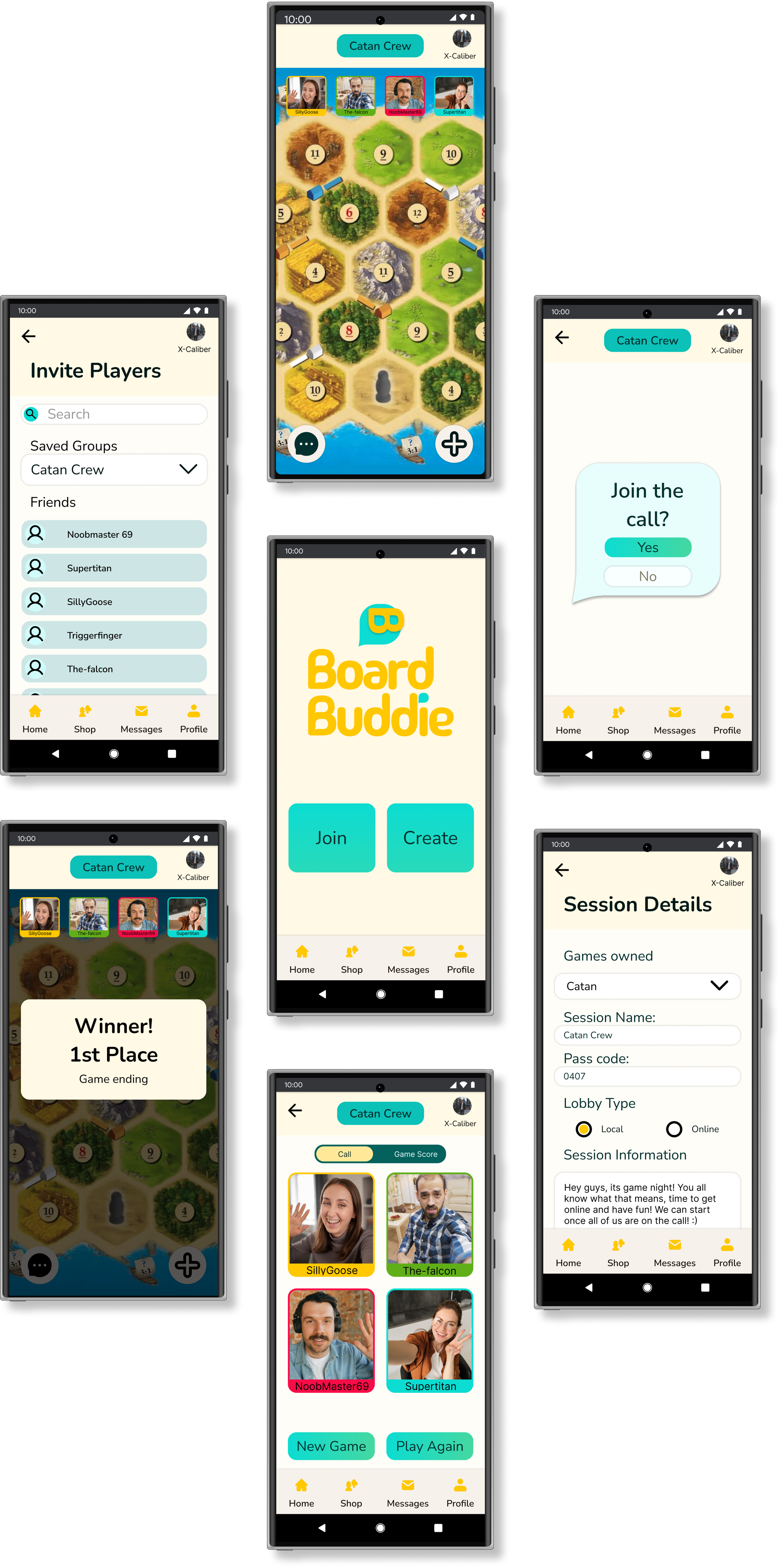
Board Buddie is an android mobile app designed to provide digital tabletop board game players a platform
Capstone Project
10 Weeks
Android
Tools
Figma
Otter.ai
Ux Researcher
Ux/UI Designer
Time Line
Platform
Role
Project Brief
Lets setup the board up!
Problem space
With today’s current industry adopting more digital platforms, the conversion of physical tabletop board games hasn’t been converted digitally in all its essence. The social bonding in digital tabletop board games hasn’t quite caught up to the experience of playing around a physical table.
Solution
A product focusing on connecting players while playing digital tabletop bard games.
Research
So where do we start?
87%
A study found people rated the social connectivity of digital games lower than its digital counter part 7/8 times.
“Social Connectivity has the most change in the digital implementation. Without third-party tools for communication the social aspect of the game were diminished or barely usable”
75%
“A survey of 1479 merchoid customers in june 2023 showed over 3/4 of respondents say that the in-person element of tabletop games and board games is important to them”
Gaining solid grasp of the the topic felt really important to me, to set a strong foundation for the project. To accomplish this I set out to do two things: secondary research, and primary research.
Interview
Getting to know the players!
After getting secondary research, I conducted 6 interviews for qualitative data on their pain points, motivations, behaviours, and suggestions they feel would solve this problem.
“…it felt really disconnected because i was not able to type custom text in there. And they were like, emojis, which I really didn’t understand what they mean.”
—Amy
“We actually feel like we’re bonding when we do it. And it’s usually just something to use like to talk about while you’re having other conversations as well.”
—Sarah
“…talk them in a way that you would normally message when you're friends you see regularly right now and then you just don't because it's not in the same app.”
—Steven
Affinity Mapping
What are the key take aways?
From those interviews, I organized interviewee’s responses and analyzed them. This allowed me to better visualize and map out key themes relevant. From those 11 themes, I noted 3 main themes with the most points interviewee’s brought up. This gave my design process the proper direction needed to be human centered and acurrately uncover what under the umbrella of the problem space had to be solved.
1. Finding people to play with
One of the key reoccurring topic is the need to be able to find people to play tabletop board games with, whether in person or online that would fit their schedule. There is a lot of difficulty scheduling or knowing where to look for players interested.
2. Social interaction
Conversing with other players in a more accessible and natural way is a major concern when playing digital tabletop board games. Its what give players investment into the activity and without it not as much people would play.
3. Easy to play and join
The amount of investment it takes to participate, and the ease of access to play is another one of the key themes that have come up. Being able to quickly join or having it be easy for all types of players, even some who aren’t good at games is important.
Chosen theme
Social Interaction
Between social cues and interacting with people, social interaction is the biggest theme. Conversing with other players in a more accessible and natural way is a major concern when playing digital tabletop board games. Without social connection, digital tabletop board games would lose its appeal and engagement from players.
How might we improve digital tabletop board games for young adults aged 18-34, in order for them to feel more socially connected with other players?
Persona
Unveiling our Target User!
After consolidating interview data, my chosen theme, and HMW I crafted a persona, Lucas Smith, along with an experience map to clearly define who my target users are. This helped me keep focus on users and their experiences in my design going forward.
Goals and Motivations
Maintain and strengthen social connection with friends, even if they’re far away or have different schedules
Pain Points
Feels frustrated not being able to talk to friends while waiting for their turn
““Playing tabletop board games is one of the main ways I stay connected to my friends, but with more things moving to digital I feel very limited in the ways I can socially connect to them while playing digital tabletop board games.”
Experience mapping
Walking in their shoes!
By crafting an experience map, it allowed me to better visualize possible points of interjection that I could design for. Reviewing the experience map, I decided to solve for a point which give me the most opportunity to address my chosen theme, social interaction, during the playing phase.
Epic & User Stories
Once upon a time…
Keeping Lucas’s goal in mind, I then developed 21 user stories to help define and design features that would address his needs. After reviewing the user stories generated, it became clear, “Social Interaction” was the biggest concern. Addressing this would improve user retention if this was their main mode playing table top games together.
As a tabletop player, I want to be able to converse with other players, so that I will be more immersed in the game
As a casual player, I want to talk to my friends while playing so that I can bond and catch up with them
As a tabletop player, I want to hear to other players, so that I don’t feel I’m playing with a computer alone
Task Flow
Setting up the Quest
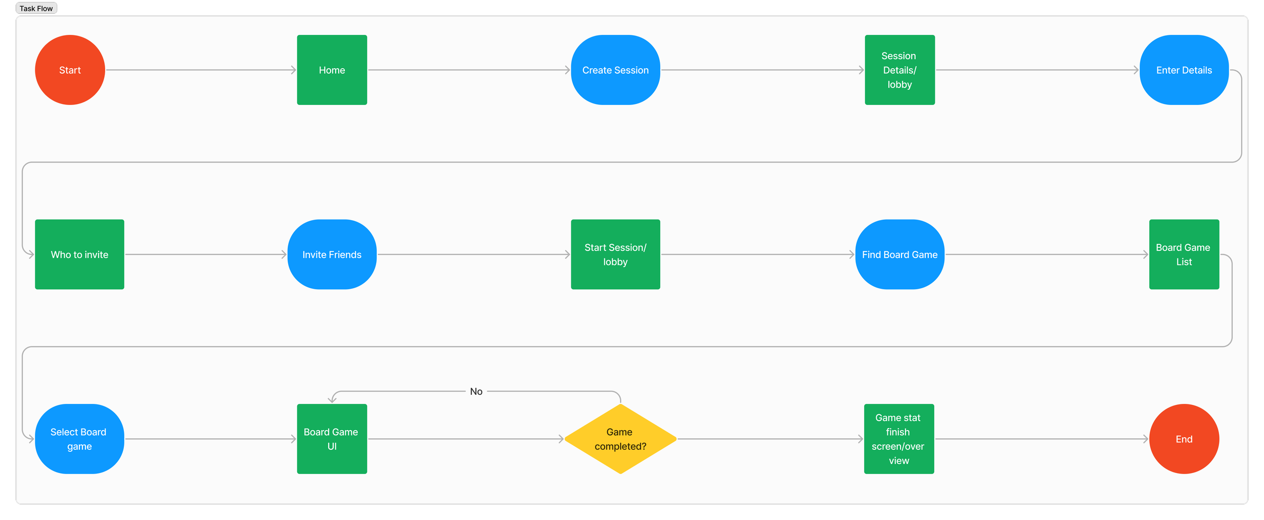
After narrowing down what user stories and epic I needed to design for, I created a task flow that would incorporate my design decisions tackling Lucas’s pain point, social interactions. What was key was having different means of communication that felt most similar to when players were in person playing together.
Sketches
Setting up the building blocks
Reaching the sketching phase, I knew I needed to a larger pool of information to help me. I grabbed design UI inspiration that helped me draw multiple variations of each page before I distilled the sketches, picking and choosing which functionality fit best with helping Lucas.
Variations of the home screen
Mid-Fidelity
Paper to Pixels!
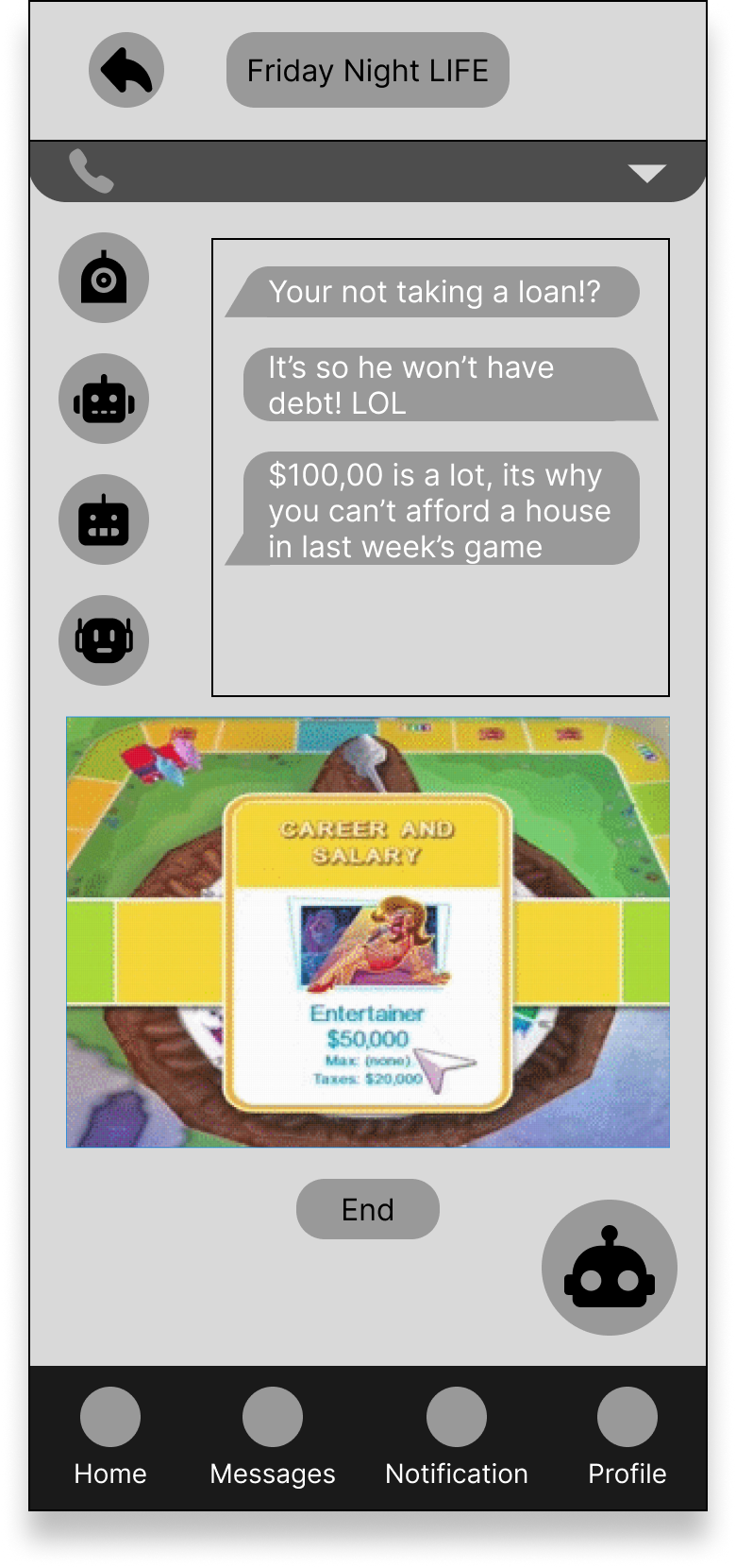
Shifting from sketches to a grayscale wireframes allowed me to design, and test multiple iterations of the product. Through this process, I could adjust and incorporate changes that pushed in a better direction.
V1
V1
V3
V3
User testing & Iterations
If first you don’t succeed…
Shifting from sketches to a grayscale wireframes allowed me to design, and test multiple iterations of the product. Through this process, I could adjust and incorporate changes that pushed design in a better direction. I took user feed back from 2 rounds of tests with 5 users each, using a prioritization matrix to organize my approach to changes.
User Testing Round 1
Althought the task flow had been address well, there were other criteria that wasn’t address.
There were mixed opinions on the player icon location
How the chat and the board game ui had distrubted its space didn’t feel right with users
As well user felt some of the icons and their location was off
This mean that some of the hierarchy and placement were the focus going into the next stage of the prototype
User Testing Round 2
Clearer hierarchy and placement of elements will help users navigate the app better.
Explore other ways to invite groups or friends to more user control and freedom
The new board UI did address the problem space but can be improved and more evident in how it address it
Mood Board
Developing a brand
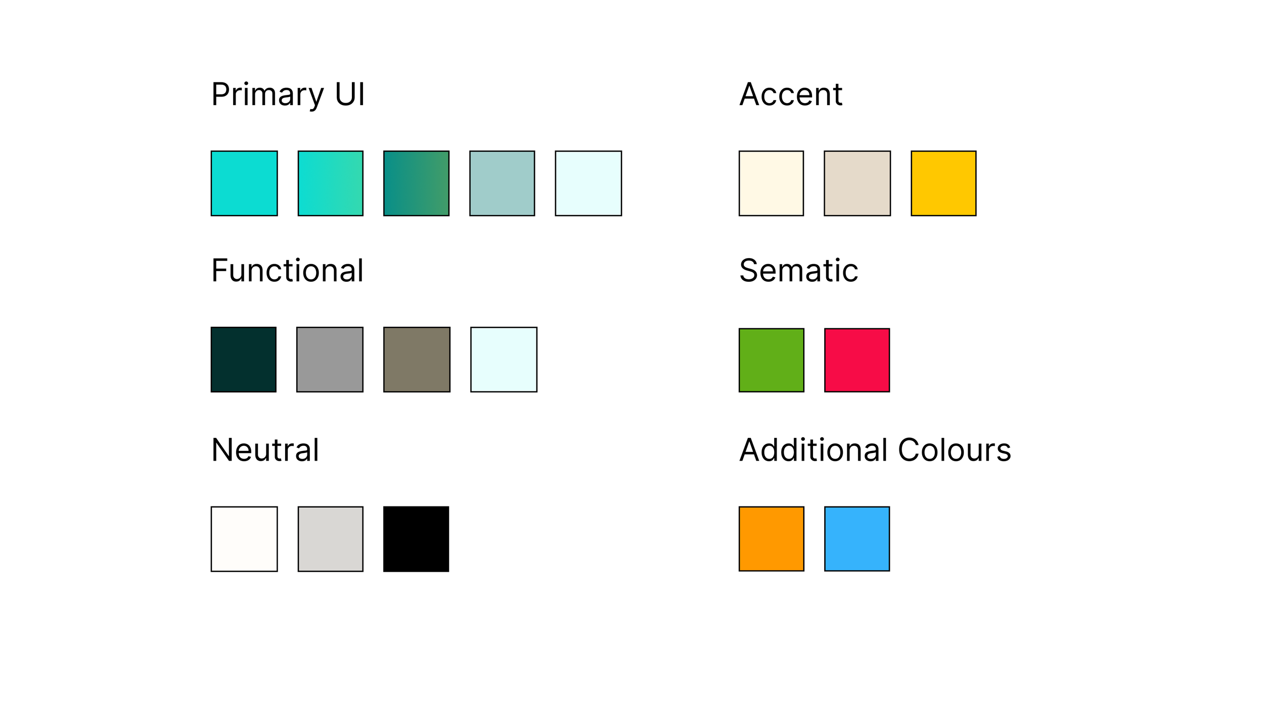
After finalizing the functionality, I then jumped straight into brand development. I needed to decide on colour, tone of voice, and typography amongst other elements. To get me started, brainstormed different themes, and adjectives before distilling them into 4 keywords I felt embodied my brand. From there I created an inspiration board which I extracted my colour palette from.
Vibrant
Dynamic
Revitalizing
Welcoming
For the Brand colours I choose a yellow/orange and a teal. Yellow/orange was my primary brand colour as it conveyed happiness, enthusiasm and is often associated with the sun and summer. This fell in line with youthful fun aesthetic I wanted for my brand, to have it feel vibrant and dynamic. I then paired it with teal being its complementary colour, as well because the colour promotes clarity, and open communication which fit what my brand wanted.
Wordmark
Naming the Brand
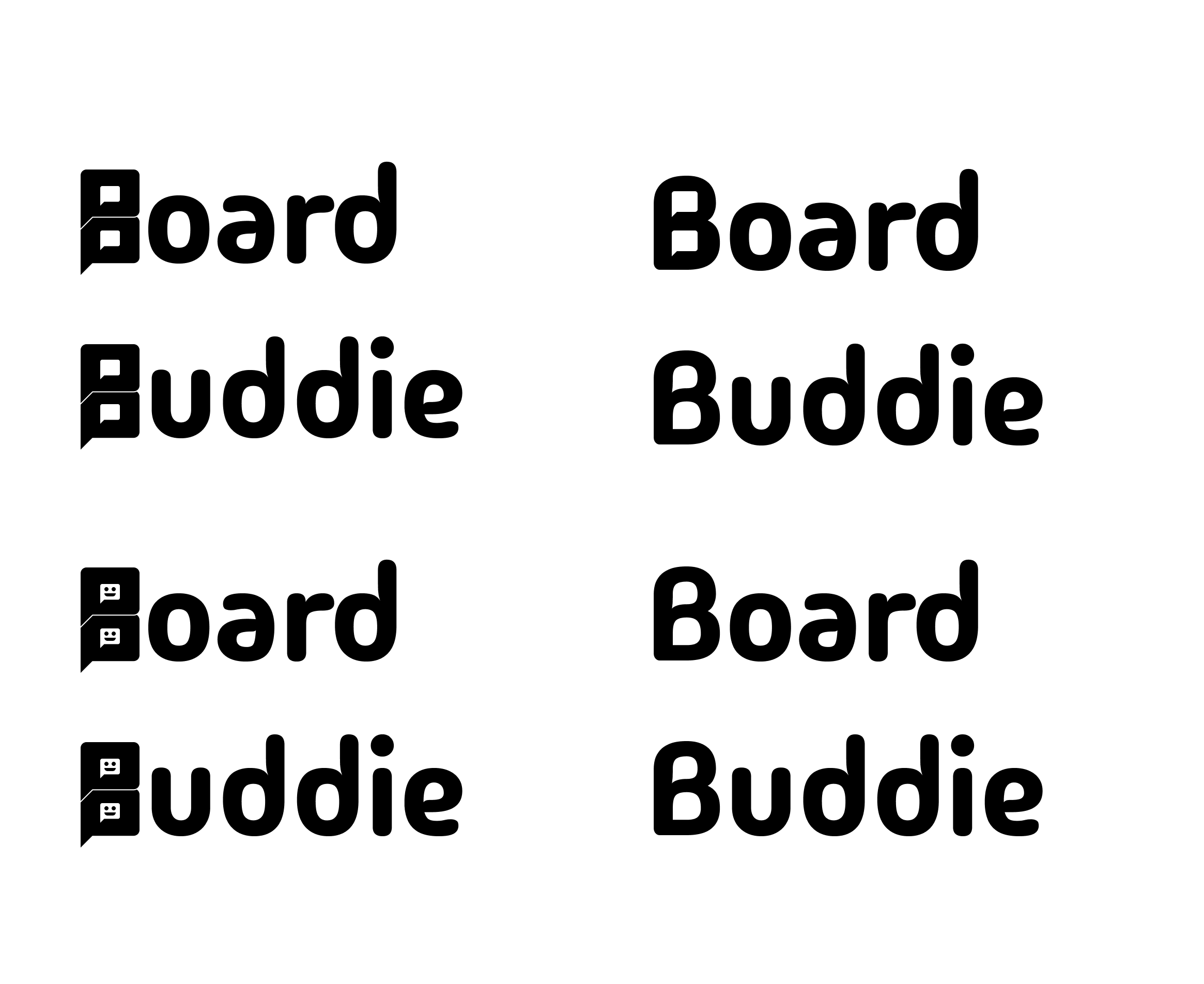
After generating multiple brand names and asking for peer review I settled on Board buddie. It gave the sense of friendliness while still referencing tabletop board games. Its alliteration also added to the sense of friendliness while easy to remember. From there I delved into typographic inspiration and decided with intention on choosing a typeface that was: round, friendly, legible (san serif), and simple to match my brand. After comparing multiple typefaces, keeping in mind the characteristics I decided, I settled with Madimi One.
Continuing, I produced multiple variations with the chosen typeface, incorporating different subtle adjustments to the wordmark before finalizing my decision and applying brand colours to the final product. I chose this wordmark for the subtle changes to the negative space of the letters. I’ve incorporated small speech bubbles into the typeface as well as adjust the spacing.
Final Wordmark
App Icon
A Picture Worth a Thousand Words
Knowing that my product would be on a mobile viewpoint and that its image was important, I wanted to have my app icon express similar feelings of youthfulness while not being too straining on the eyes because of my colour palette. I crafted multiple variations for the logo before settling on one style and trying multiple colour patterns and variants.
I settle on using a chat bubble, similar so what I had already incorporated into my wordmark to keep consistent branding, and using the letter “B” turned sideways to represent glasses. This created a mascot that showed a fun personality, easily recognizable.
UI library & Design System
Gathering all the pieces
As part of the design process, if I were to every have any other designers and developers work on the project, I needed a to have a consistent design system in place. I crafted a UI library containing everything used in the app categorized into foundations, atoms, molecules, organisms, templates, and pages.
During the design process, I did note that because of the high colour contrast, brightness, and saturation it may be hard for users such as Lucas to read. I also considered that if this app were to be used by other demographic groups other than my targeted one, I would need my colours to pass WCAG. As a result, I reaccessed some of the colour decisions and checked to see if they passed WCAG standards. Some did not pass however, though that was intentional.
Hi-Fidelity Prototype
Putting all the pieces together
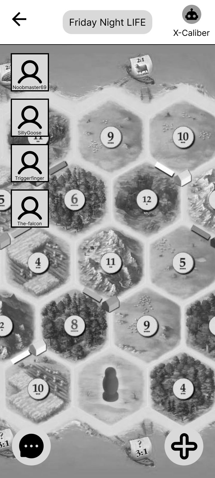
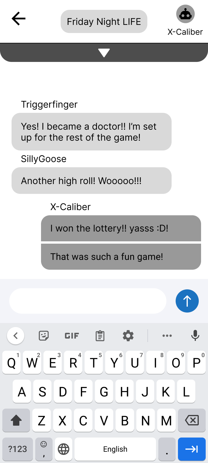
With all the UI library, wire framing, and branding completed I put everything together! While still looking at inspiration in the process, and making minor aesthetic adjustment based off peer review, I finalized Board Buddie!
Marketing
Say it Loud!
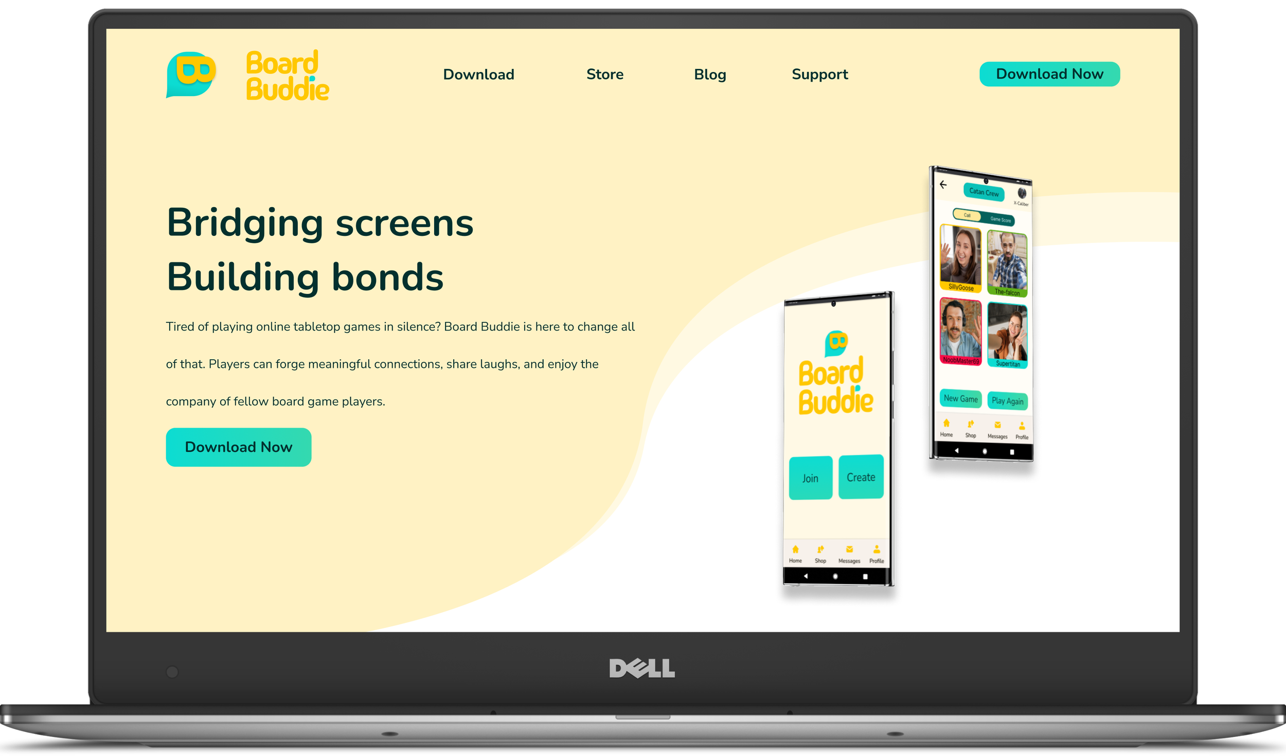
Who wouldn’t want to be able to play digital tabletop board games with their friends online! But people like Lucas need to know about it, so I made a responsive marketing website for both mobile and desktop viewports. The website keeps consistent branding with the app using a clean, bright, and fun design focusing on getting new users to Download Now.
Design impact
What’s the score!?
Having completed my capstone project, really put into prespective what human-centred design really is. I had to keep my users at the forefront of my thoughts to create a product dedicated to helping them maintain social connection. With my current design, on mobile, it allows people like Lucas to play with their friends regardless if they’re at home, on transit, or far away. By allowing them to communicate with the addition of voice and video in a single platform, it removes the obstacle of juggle multiple third-party applications to play and communicate which can break the immersion and flow of gaming for people like Lucas. The addition of this communication style (video,voice) is also more natural, and adheres closer to what we as humans communicate like in real life. This design sought out to help digital tabletop board game players to strengthen and maintain their social connection with their friends, and I’d said it does!
From here I wanted to consider not just present but future applications and concents that may arise from this project. To help me explore this, I used Tarot Cards of Tech.
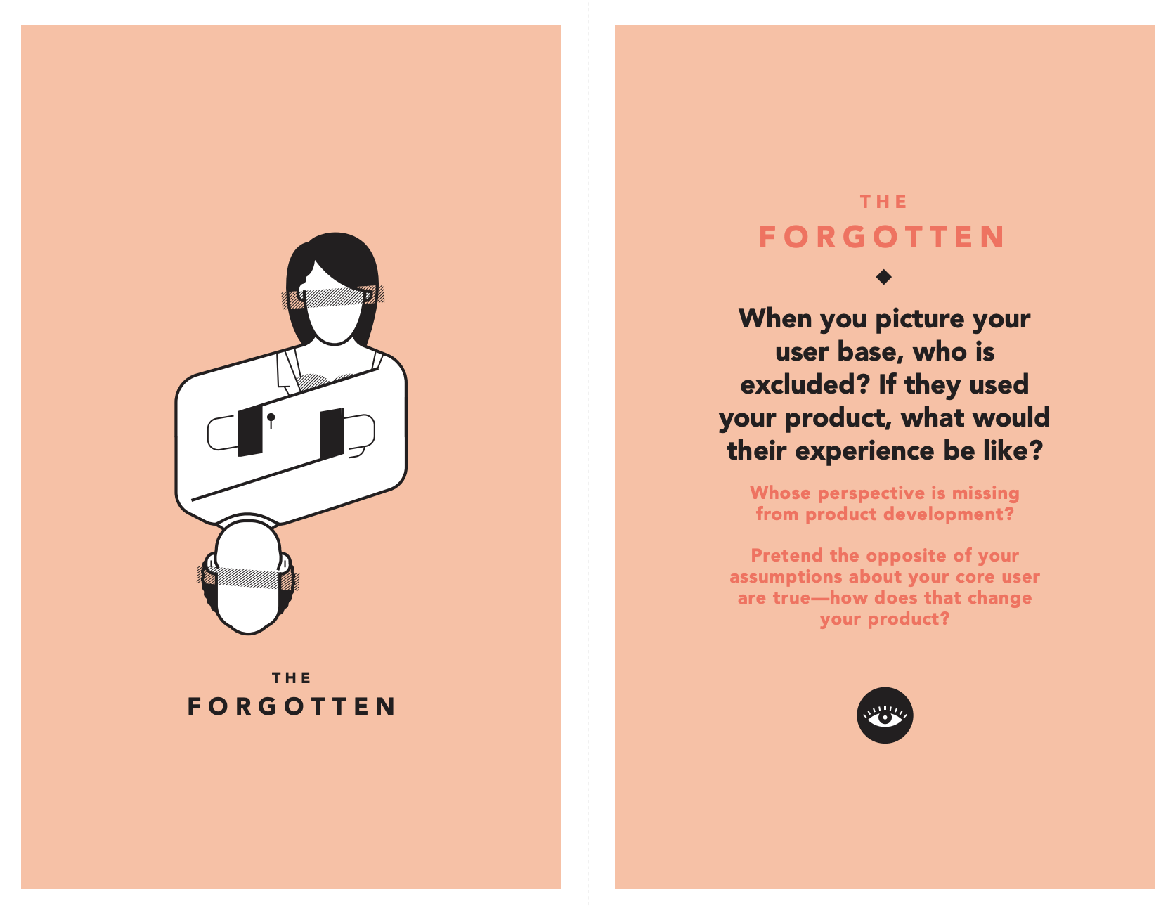
When you picture your user base, who is excluded? If they used your product, what would their experience be like?
When I picture my user base, I excluded people from a more professional setting. If they were to use my product, it would be implemented as team building exercises and activities. It would be used as ice breakers when introducing new teams together or new business partners with one another. This would help with companies that are work from home and don’t have an office space. However if my assumptions about my user base were to be reversed, my product would then have to focus more on game play immersion and allow options for users to take a seat back from communicating while playing.
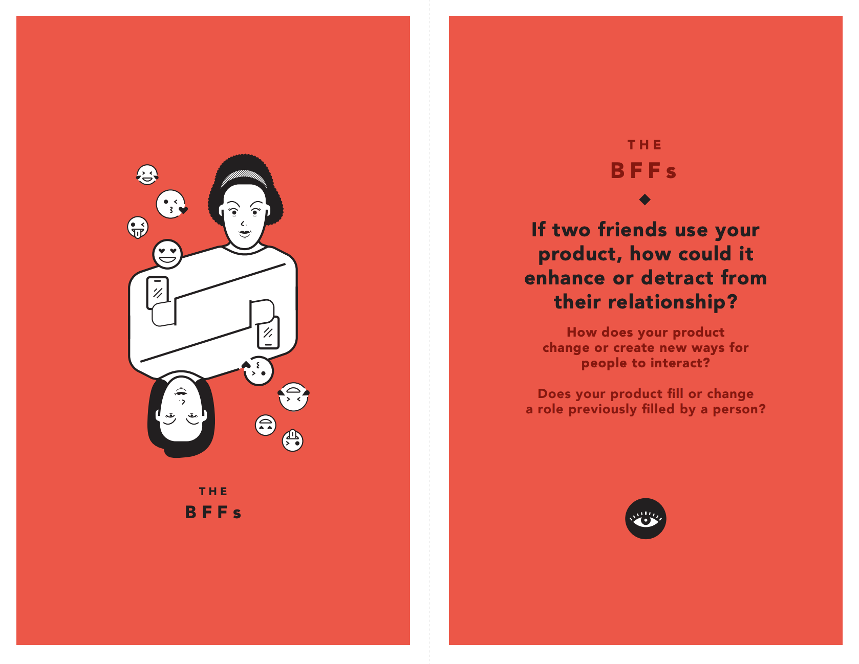
If two friends use your product, how could it enhance or detract from their relationship?
If two friends were to use my product, it would definitely enhance their relationship. Although my product wouldn’t fill the role of a person, it would allow that person to fufill their role at a distance. By being able to play online, the setting of playing tabletop game in person would be an option rather than a necessity. Users would be able to play with each other in their down time while waiting, during transit, before bed, etc. This opens more opportunities of interacting and communicating with their friends which previously would not be as viable of an option.
Key Learnings & Next Steps
Key Learnings & Next Steps
Learnings
After finishing the capstone project, I took a step back to look at the entire process. It was eye opening to see how important it is to keep human-centred design at the forefrent of your mind when designing. I noted 3 major key lessions from this project.
Language
During my design process, I realized that language and how we write narrative in our work is quite important, the subtlely can drastically change user answers and how they navigate our app.Organization
I learned I needed structure my work flow in order to keep up with the demand of projects and deliverables. As well, I needed to focus on the producing a minimun viable product rather then continuously refining and editing my work.Research
Knowing our users is at the heart of our design process. By doing interviews very early on, we have more time to process our findings to properly and clearly see what our users will need.
Next Steps
I would like to spend more time developing solutions for other pain points like scheduling from Lucas’s experience map. As well, developing other features outside of the game such as a store or messaging to help further maintain that social connection would be something I’d want to attempt to design for. More user testing would help me better understand user needs, preferences to fully flesh out the application.

